INdesign how to protest magazine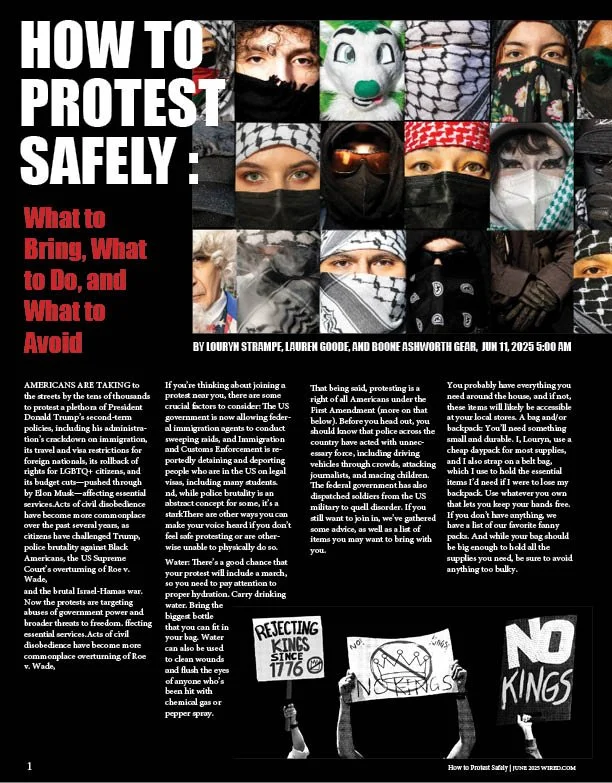
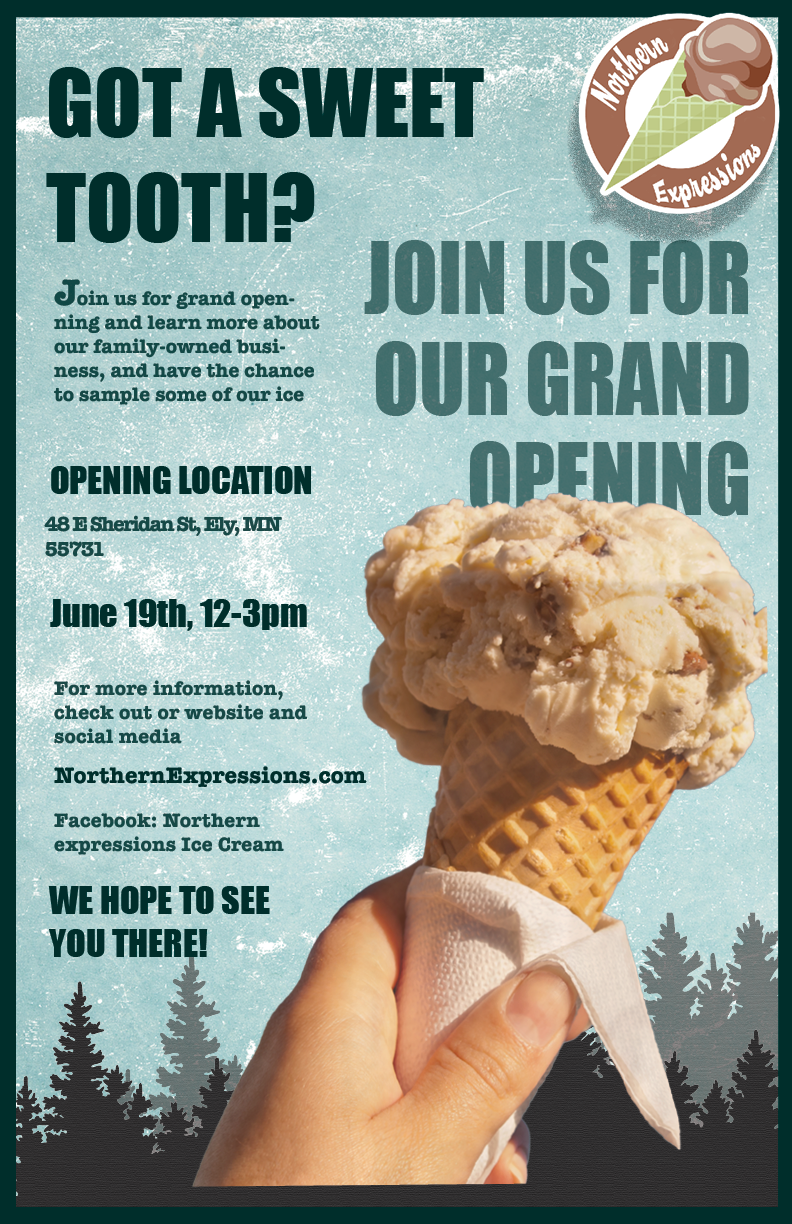
COMPANY POSTERThis poster was created to promote an event, specifically the grand opening of an ice cream shop. I based the business on a small shop in Ely, Minnesota. I know the owner personally and received permission to use her business as inspiration for this project. Although the company has been established for years, I reimagined it as a grand opening for the purpose of the design.
I aimed to create a poster that reflects the shop’s atmosphere, focusing on a vintage and cozy aesthetic. I also incorporated woodsy elements to reflect its northern Minnesota location. This style differs from my usual work, but I believe I successfully achieved the intended look and feel.
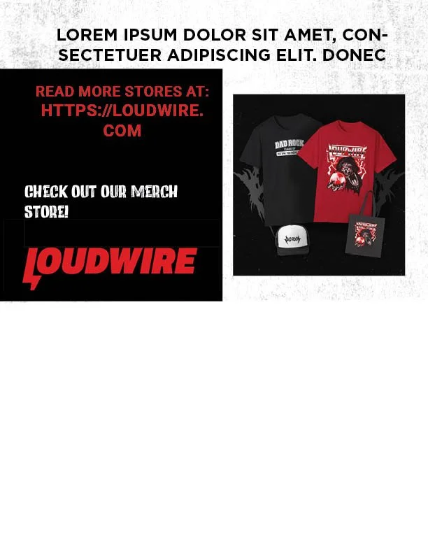
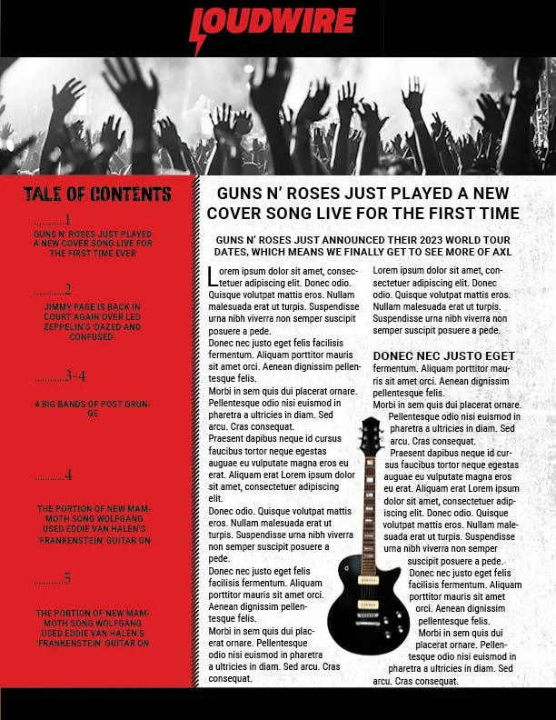
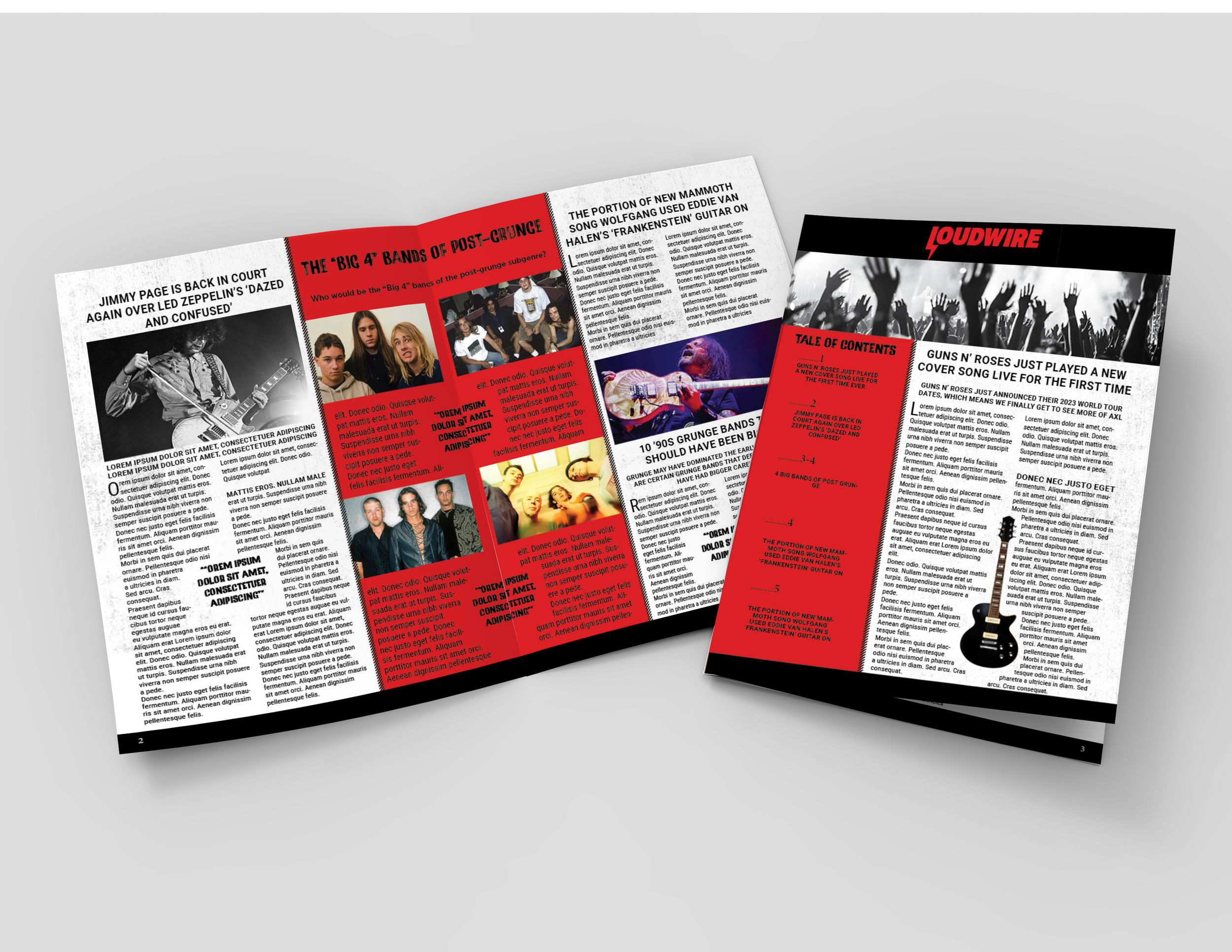
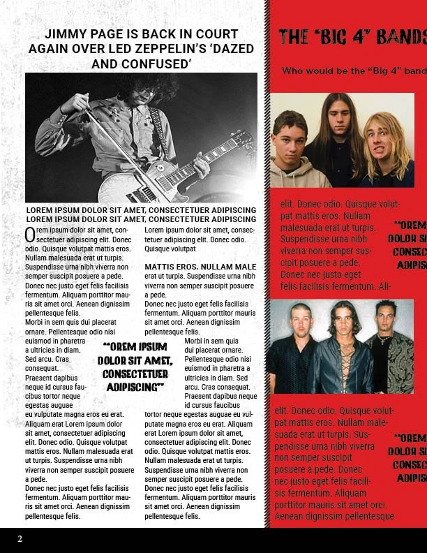
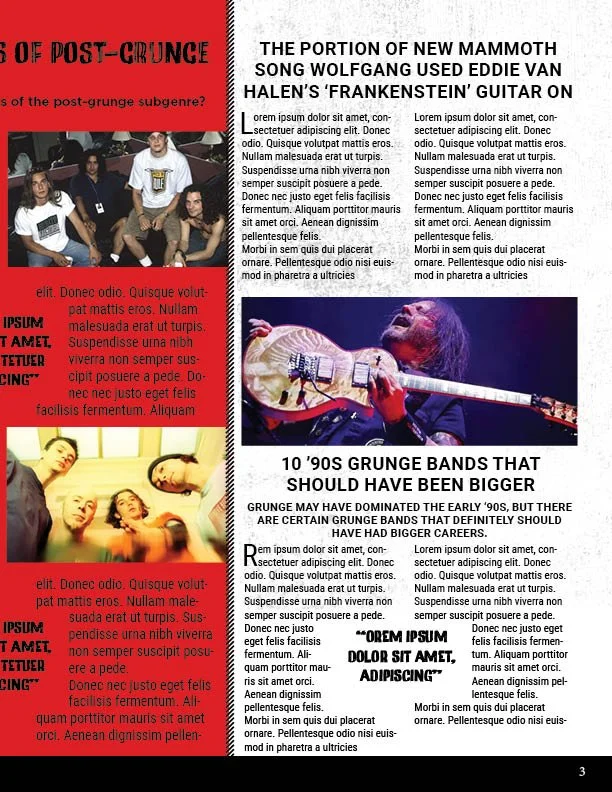
LOUDWIRE NEWSLETTERI was tasked with designing several pages of a newsletter, with the news source of my choice. I selected Loudwire and continued with a music-focused theme throughout the design.
One challenge I faced was fitting four stories and a table of contents into just three pages. To solve this, I took one of the shorter articles and spread it across the center of the newsletter. This made the layout more engaging while still including all the necessary content.
I sourced the article titles and images from the Loudwire website and created the final piece using Adobe InDesign.
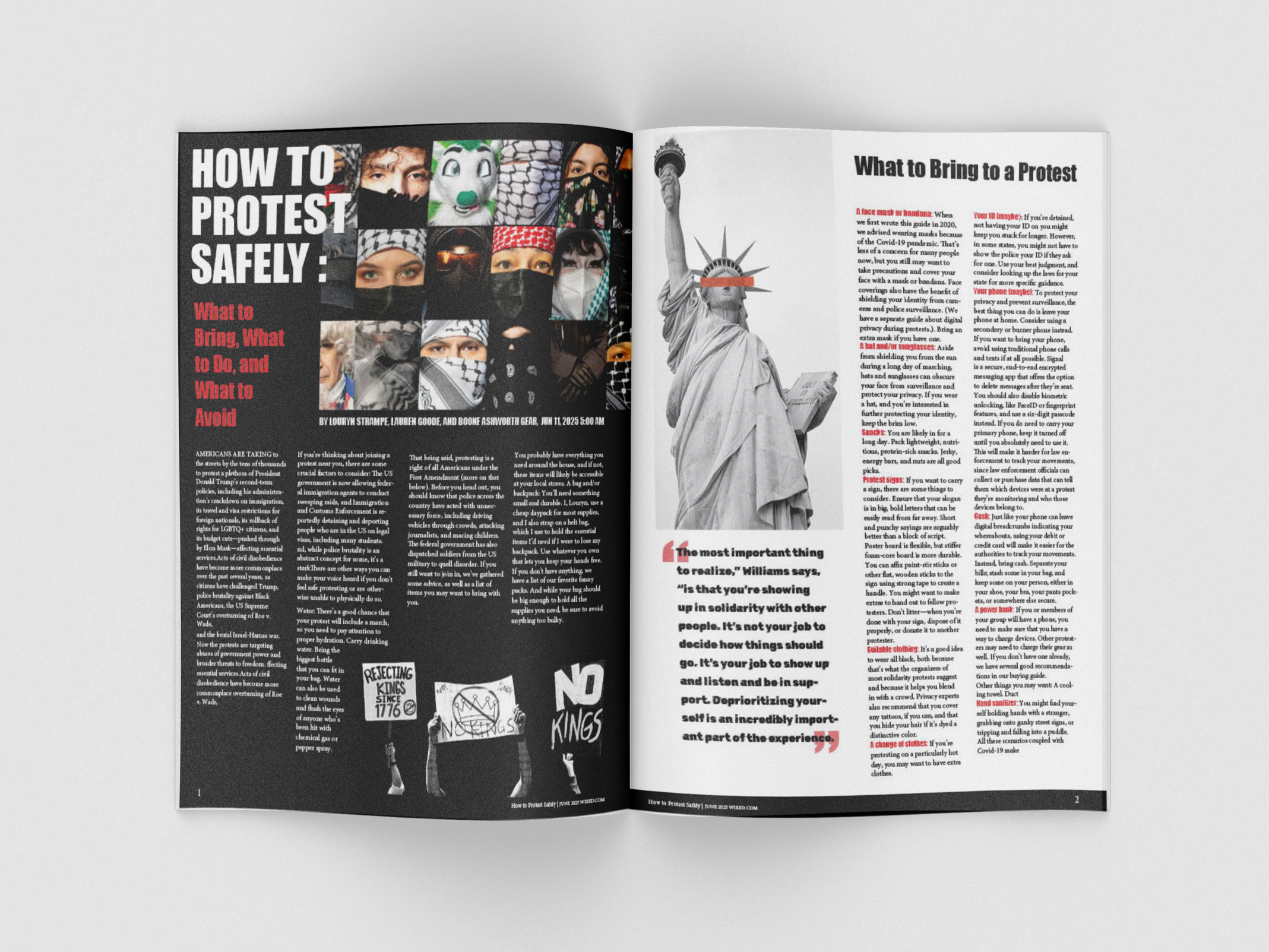
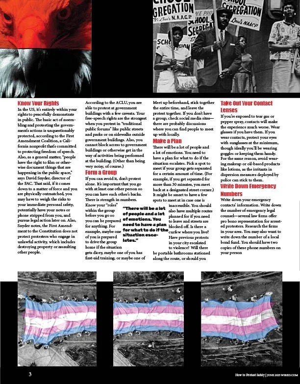
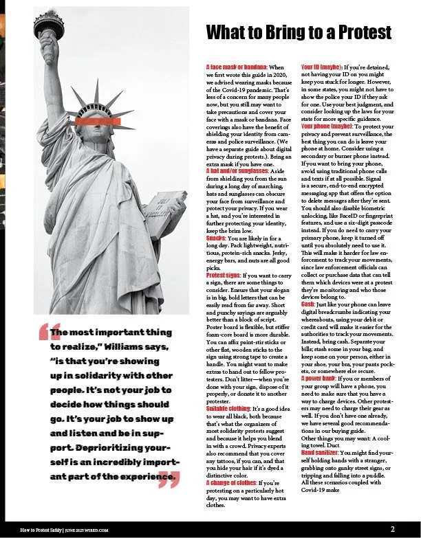
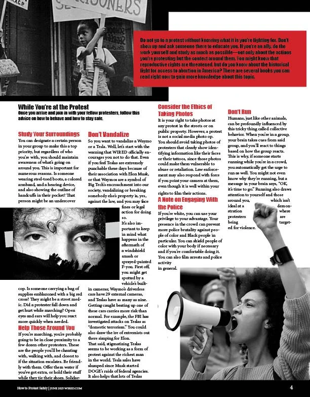
For this project, I was tasked with selecting an online article and designing a magazine spread based on it. I chose the article “How to Protest Safely” because it is a topic I personally connect with and one that is important to a wide range of communities.
I maintained a consistent grunge aesthetic throughout the spread and used a limited color palette of black, white, and red to reinforce the tone of the subject matter. I incorporated images from the original article, along with additional visuals sourced from Adobe Stock.
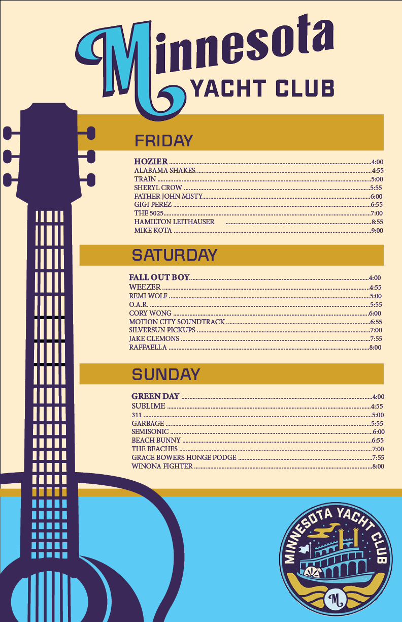
MUSIC FESTIVAL POSTERThis poster was created as part of an assignment to design promotional material for an event. I chose to base my design on the “Minnesota Yacht Club” music festival. One of the main challenges was maintaining the original branding style, which relies heavily on illustration.
To stay consistent with the festival’s identity, I used the same color palette and typography, helping the design align closely with the existing brand. I sourced event information, as well as the logo and heading, from the Minnesota Yacht Club website. The guitar illustration was obtained from Adobe Stock and recolored to match the brand.
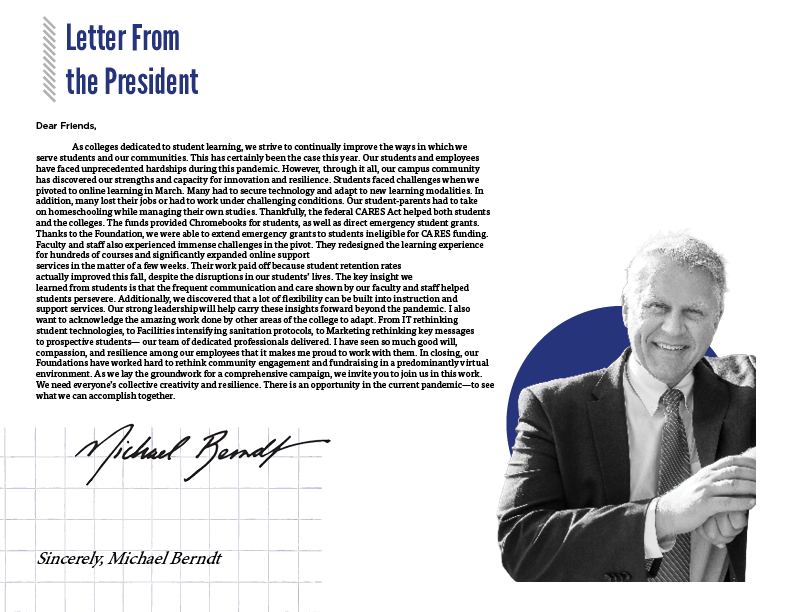
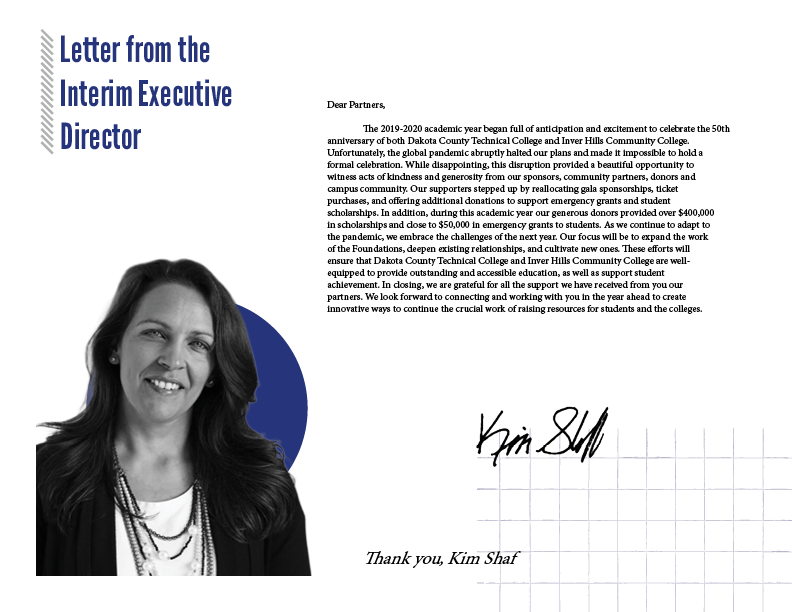
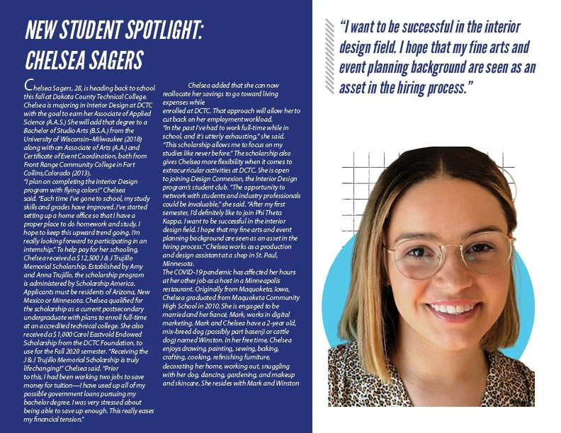
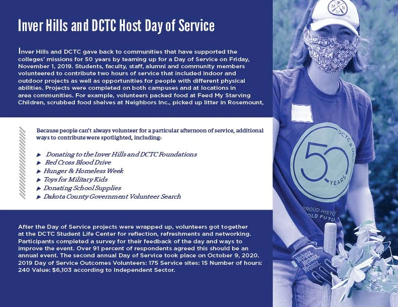
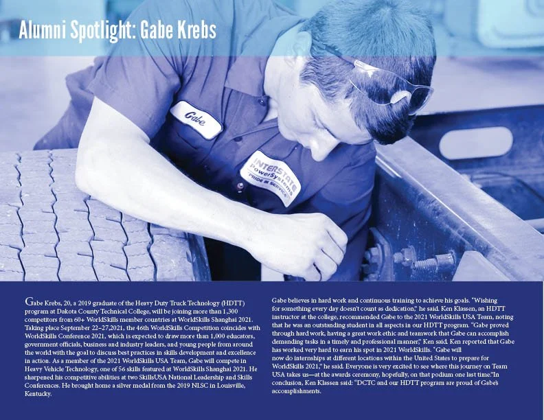
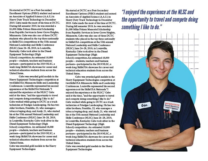
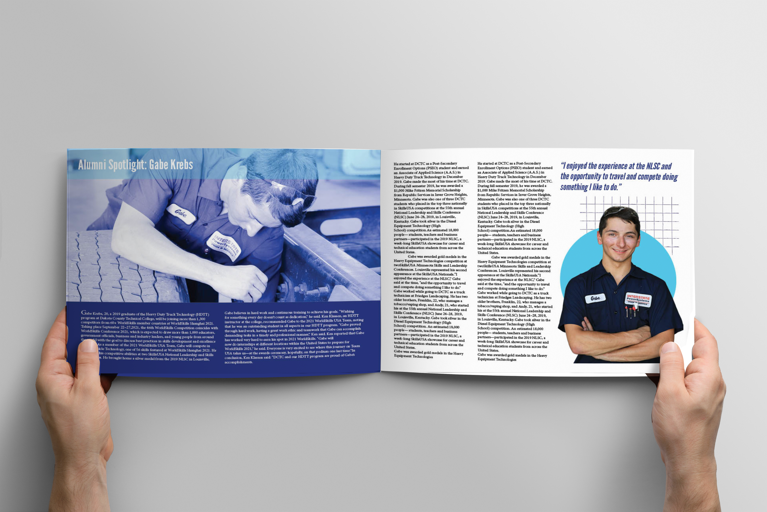
DCTC ANNUAL REPORTI was tasked with creating a mock annual report for Dakota County Technical College. For this project, I designed a layout that is clean, easy to navigate, and aligned with the school’s established color palette and branding.
All materials, including the content, images, and branding guidelines, were provided for the project. Using these resources, I focused on organizing the information in a clear and visually engaging way.