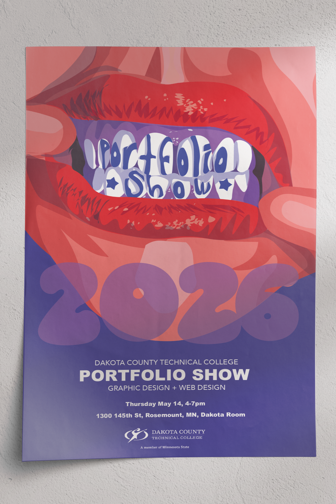
IllustratorPORTFOLIO SHOW POSTER
For the Dakota County Technical College graphic design portfolio show, graduating students were tasked with creating a poster to represent the event. We were given full creative freedom in what we could design and submit.
I chose to take an unconventional approach by creating artwork centered around teeth—something unexpected that immediately captures attention. The concept is also symbolic: as designers, we communicate visually, so using a mouth with words incorporated into the teeth represents “visual speaking” in a literal way.
I selected a purple and red color palette to create strong contrast, allowing the red lips to stand out prominently. While the concept is bold and unconventional, it effectively draws attention and communicates the message in a memorable way.
I designed the poster in Adobe Illustrator, formatted it in Adobe InDesign, and also created a corresponding postcard using Adobe InDesign. Sketch was done in Procreate.
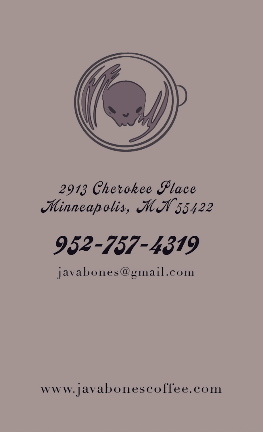
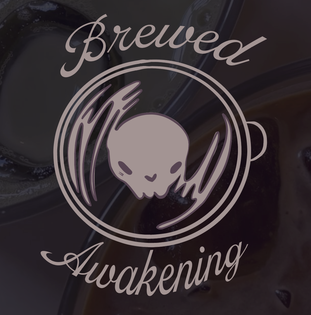
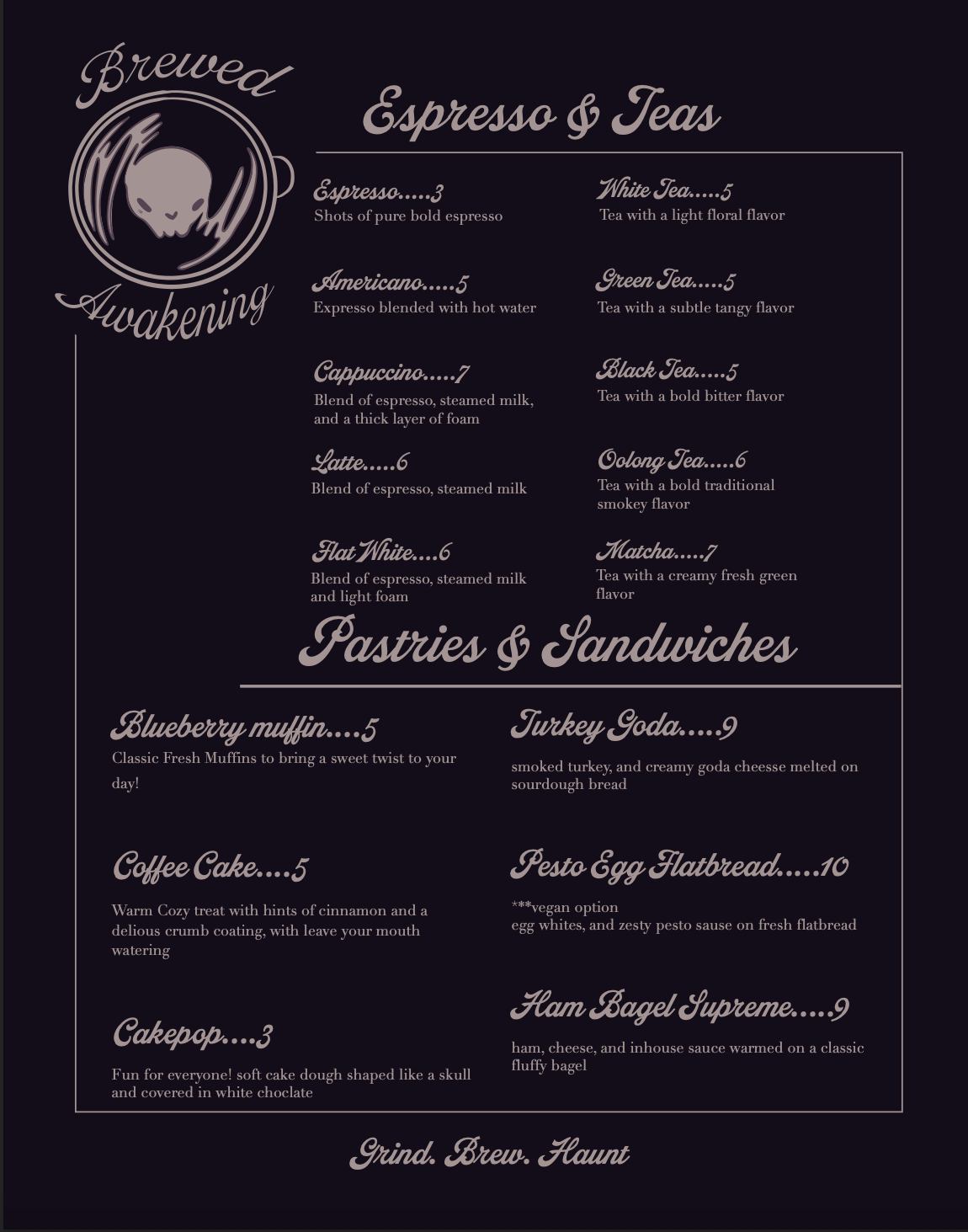
BreweD Awakening“Brewed Awakening” is a coffee brand I created as a school project. The assignment was to develop branding for a coffee shop that would stand out from competitors in Minneapolis. I chose a gothic aesthetic, designing a logo that features skull-shaped latte art.
For this project, I created business cards, a menu, a color palette, and mockups for the brand. I used Adobe Illustrator for the layouts, Adobe Photoshop for the mockups, and Adobe Fonts to select typography.

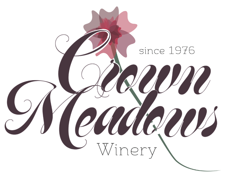
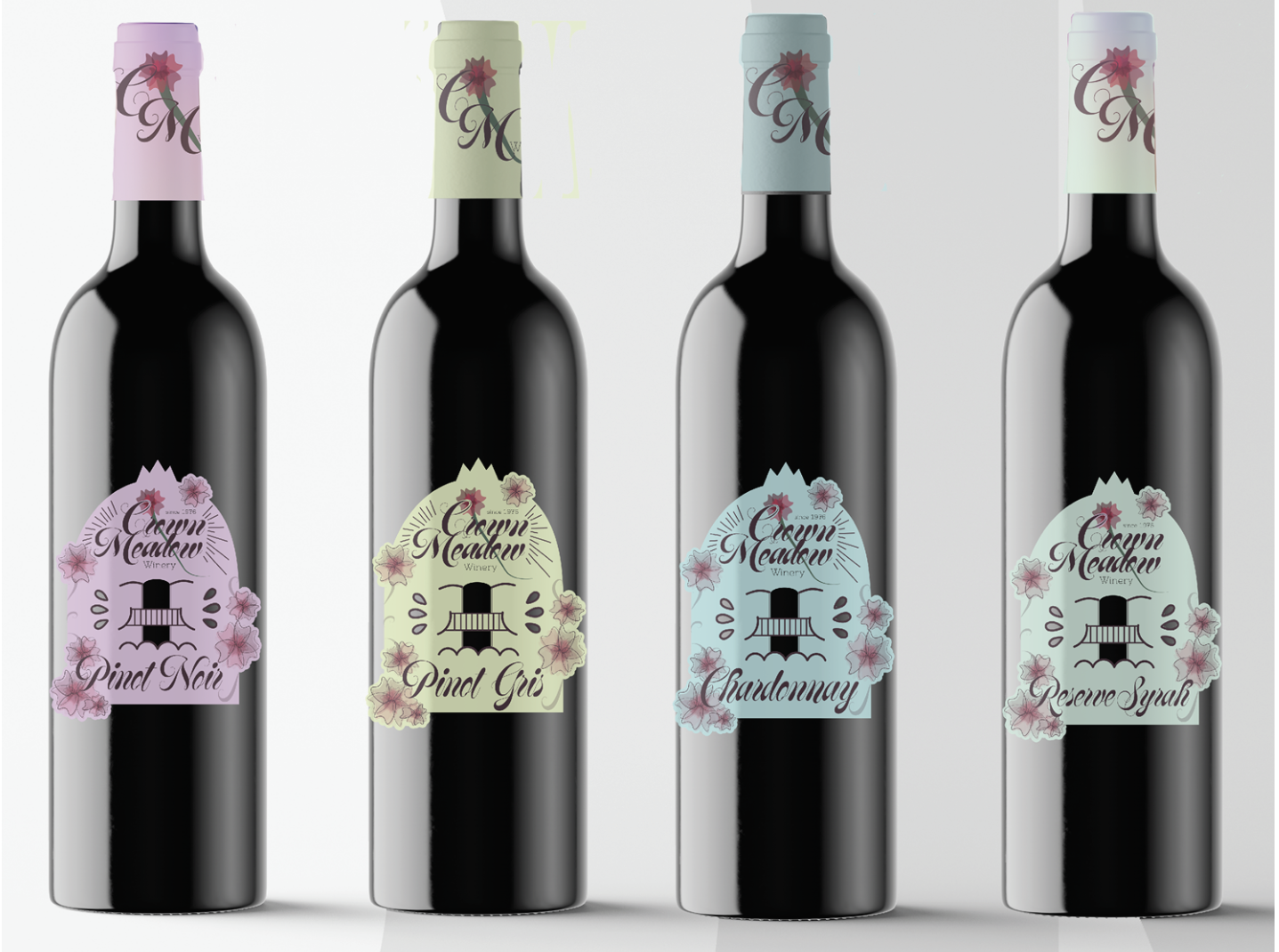
CROWN MEADOWS WINERYWe were given a staged scenario to rebrand a wine company, “Crown Meadows,” for a younger audience. I refreshed the brand with brighter, playful colors and more illustrative, uniquely shaped labels.
I focused on the “meadows” aspect, using detailed floral illustrations to create a more inviting identity. Research into the winery’s region revealed strong Spanish architectural influences, which I incorporated through red carnations and decorative elements inspired by Spanish design.
The result is a minimal yet artistic label that appeals to a younger audience while maintaining elegance. I used Adobe Illustrator for the logo and labels, InDesign for the branding guide, and Photoshop for mockups.


PACKAGING

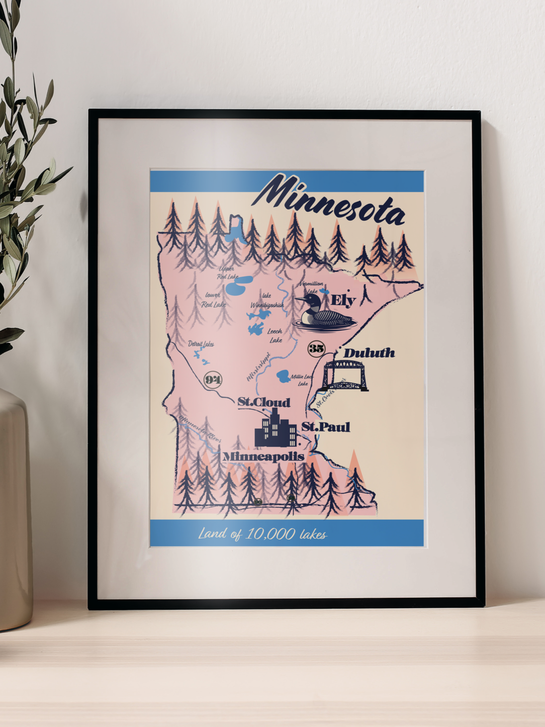
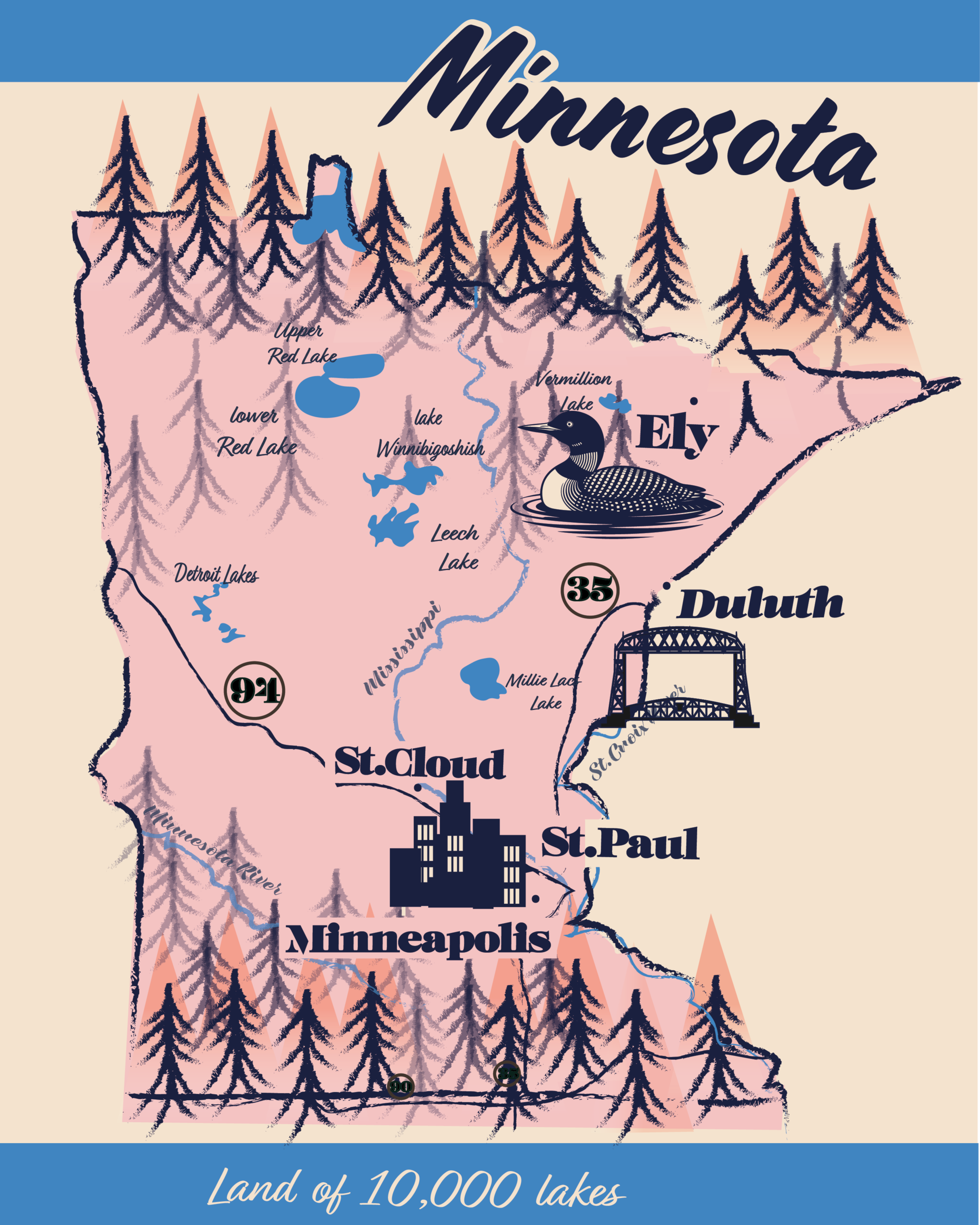
minnesota mapI was tasked with creating an accurate map of Minnesota while having full creative freedom in the visual design. I chose a bright, illustrative style, using a limited yet vibrant color palette and incorporating icons to represent popular cities throughout the state.
I created the map in Adobe Illustrator, designing the state shape, trees, and city elements. I chose this aesthetic to help the map stand out from more traditional Minnesota maps, aiming for a look that feels both classic and visually engaging.
The loon and the Duluth bridge illustrations were sourced from Adobe Stock, and I selected the typography using Adobe Fonts.
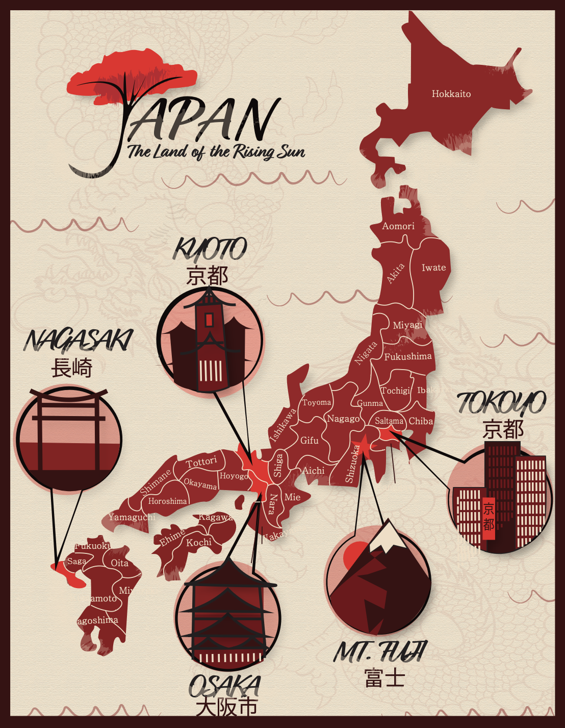
JAPAN MAP AND LOGOI was assigned to create both a logo and a map for a location of my choice. I chose Japan because it is a well-known destination with a rich and unique culture. When developing the overall look for both the logo and the map, I drew inspiration from traditional Japanese paintings. Key characteristics I incorporated include expressive brushstrokes, a red and tan color palette, and stylized natural elements such as trees.
For the logo, I maintained the brushstroke style and chose a cherry blossom tree as the central element, since it is strongly associated with Japan. To make the design more distinctive, I transformed the letter “J” in “Japan” into the shape of a tree. I used textured brushes to replicate the look of traditional painting techniques, and I also included a subtle dragon in the background to add visual depth and texture.
I used Adobe Illustrator to create this piece, and I sourced the dragon illustration from Adobe Stock.
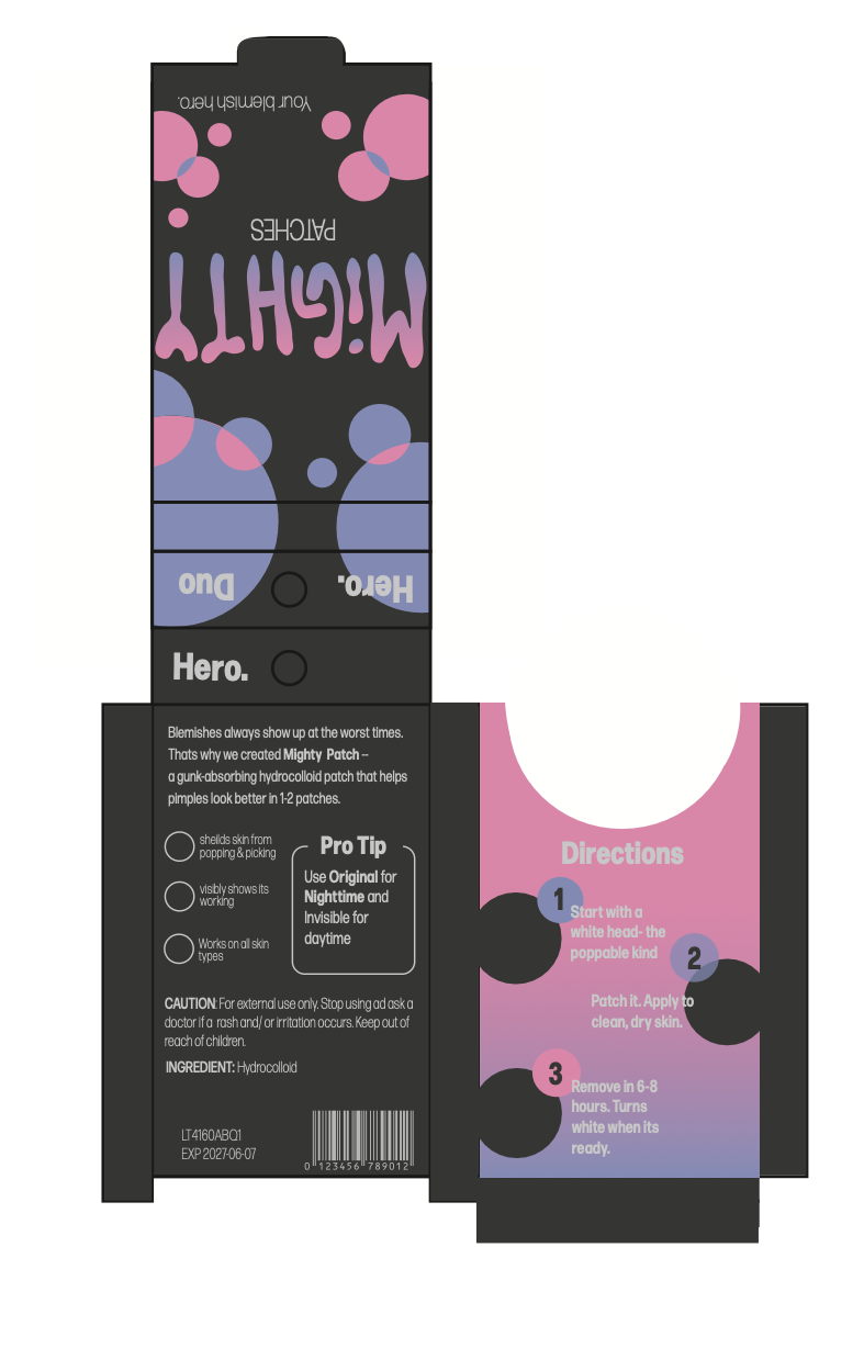
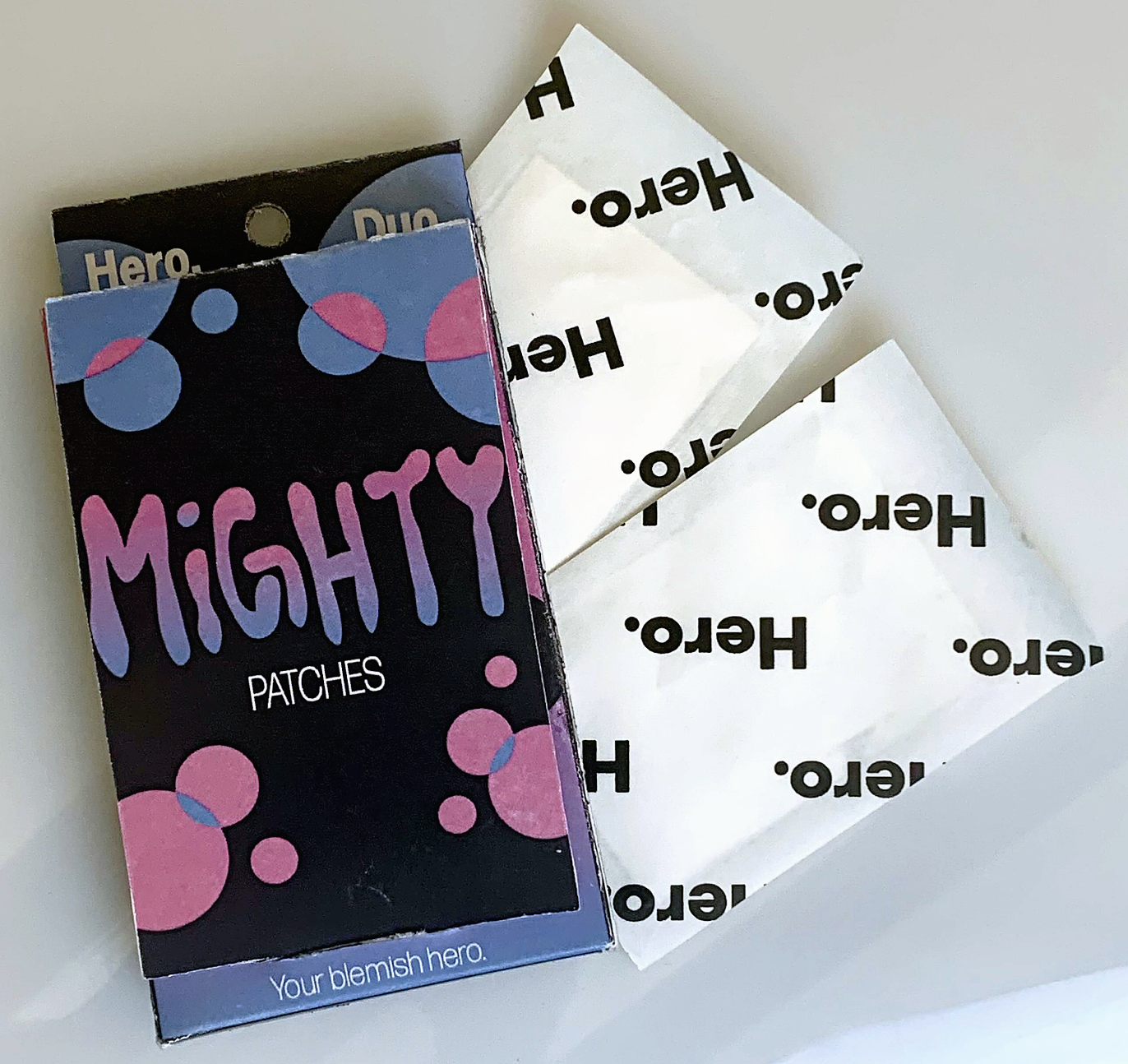
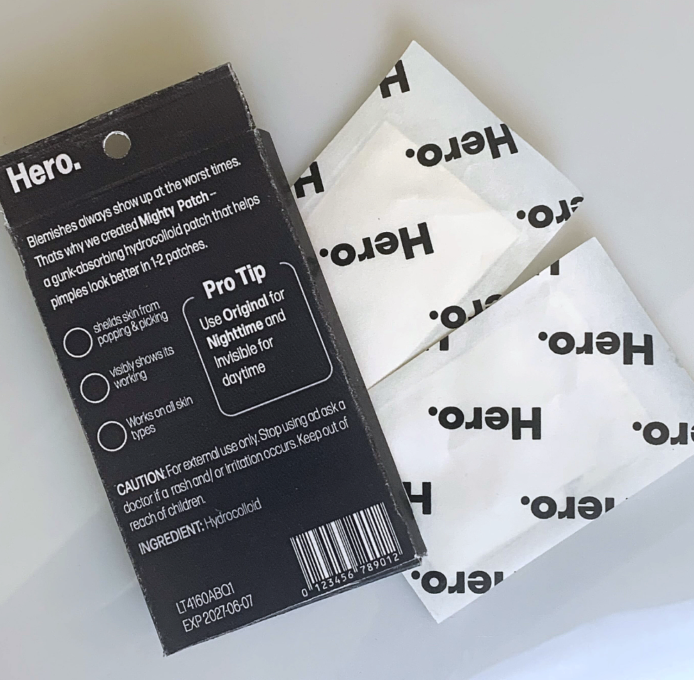
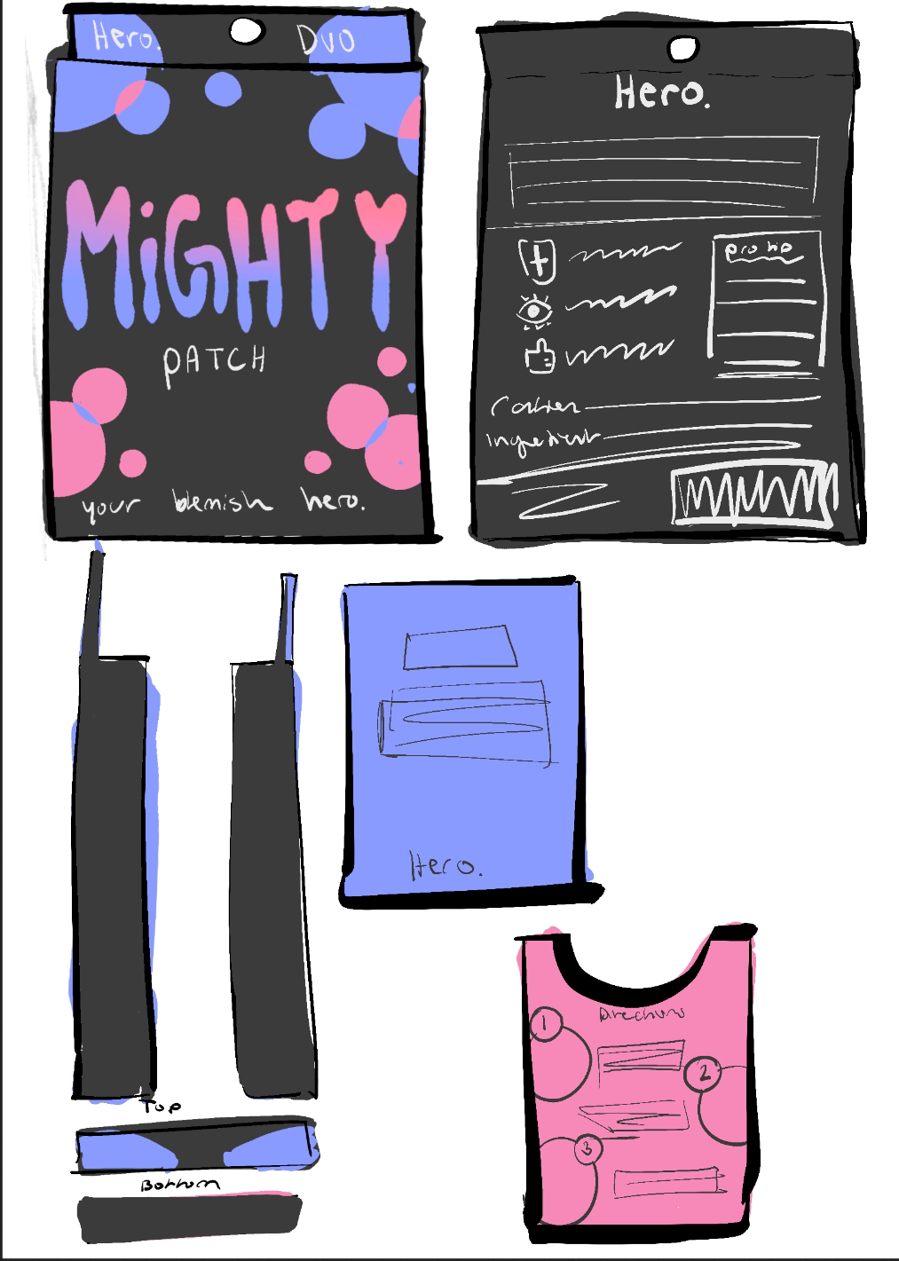
For this project, we were tasked with selecting an existing product’s packaging and redesigning it. I chose to redesign Hero Pimple Patches, focusing on making the packaging more appealing to teens, who are the brand’s primary audience.
To better target this demographic, I updated the color palette and typography while maintaining the original circular design to preserve brand recognition. Throughout the process, I developed concept sketches, experimented with color variations, created rough drafts and prototypes, and ultimately produced a final design. I then printed and assembled a physical prototype of the packaging.
I believe the final result effectively targets the intended audience and creates a more eye-catching design.
I created my initial sketches in Procreate and designed the final packaging in Adobe Illustrator.